
Few maps show Asia’s transformation over the past generation as clearly as a population-change map.
In 1990, Asia had approximately 3.21 billion people.
By 2023, that number had risen to roughly 4.78 billion.
That is an increase of about:
1.57 billion people in only 33 years. (PopulationPyramid.net)
To put that into perspective, the entire world grew from about 5.33 billion people in 1990 to 8.09 billion in 2023.
So Asia accounted for roughly 57% of the world’s net population increase over that period. (PopulationPyramid.net)
But the most fascinating part of the map is not Asia’s overall growth.
It is how radically different the demographic stories are within the same continent.
Qatar and the Gulf experienced explosive growth.
Afghanistan and Pakistan expanded rapidly.
India added hundreds of millions of people.
China grew enormously but has now passed its population peak.
Japan barely grew over the full period and is now shrinking.
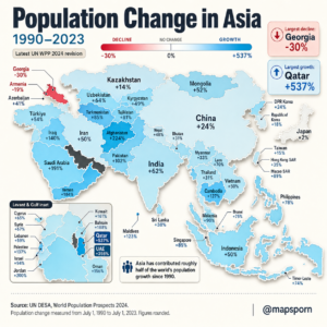
And Georgia ended 2023 with roughly 30% fewer people than it had in 1990.
Asia is therefore no longer one demographic story.
It is several completely different futures happening at once.
The Most Important Thing to Understand: Percentage Growth Is Not the Same as People Added
Qatar can show a population increase of more than 500%, while India shows “only” around 66%.
That does not mean Qatar added more people.
Far from it.
Qatar’s population increased by roughly 2.5 million.
India’s increased by roughly 573 million. (Statistics Times)
Percentage growth tells us how much larger a population became relative to its starting point.
Absolute growth tells us how many actual people were added.
Both are useful, but they tell very different stories.
India: One of the Biggest Population Increases in Human History
India had approximately:
865 million people in 1990
and:
1.438 billion in 2023.
That represents an increase of about 66%, or roughly 573 million additional people. (PopulationPyramid.net)
That is an extraordinary number.
India added more people during these 33 years than the current population of almost any country on Earth.
The reason was not simply very high fertility in 2023.
Much of the increase reflects population momentum.
India entered the 1990s with an extremely young population and large generations entering childbearing age.
Even as fertility subsequently declined toward replacement level, millions of births continued because there were so many potential parents.
This is one of demography’s most important concepts:
A country’s population can continue growing for decades after family size has fallen dramatically.
India Eventually Overtook China
During most of the modern era, China was the world’s most populous country.
That changed in the early 2020s.
India moved ahead while China’s population began declining.
UN projections continue to place India among countries whose populations are expected to grow through at least 2054, although at increasingly slower rates. (United Nations)
So India’s map color tells us about the past—but its future color would gradually become less intense.
China: Huge Growth Followed by a Historic Turning Point
China grew from about:
1.154 billion in 1990
to:
1.423 billion in 2023.
That’s roughly 23% growth, equivalent to nearly 269 million additional people. (PopulationPyramid.net)
Yet the most important demographic fact about China today is that this expansion has ended.
The United Nations estimates that China’s population peaked around 2021.
China is now among 63 countries and areas whose populations had already peaked by 2024. (World Population Dashboard)
Why the turnaround?
Fertility fell enormously.
China’s total fertility rate dropped far below the approximate replacement level of 2.1 births per woman.
The country’s population also aged rapidly.
Eventually the number of deaths began overtaking births.
So China moved within a generation from:
fear of excessive population growth
to
concern about population decline and ageing.
Few demographic transitions have occurred on such an enormous scale.
Japan: Almost No Net Growth Since 1990
Japan presents an even more dramatic contrast.
The WPP-based population series gives:
1990: 123.4 million
2023: 124.4 million
That is only about 0.8% net growth over 33 years. (PopulationPyramid.net)
But even that number hides Japan’s real trajectory.
Japan grew during the 1990s and early 2000s, reached its peak, and then entered sustained decline.
By 2023, almost 30% of Japan’s population was aged 65 or older. (PopulationPyramid.net)
Japan is therefore one of the clearest examples of what happens after decades of:
- Very low fertility
- Long life expectancy
- Limited immigration
- Population ageing
The result is fewer children, fewer workers entering the labor force, more elderly people and population decline.
The UN lists Japan among the countries whose population had already peaked by 2024. (World Population Dashboard)
South Korea: Growth So Far, Decline Ahead
South Korea’s total population is still considerably larger than it was in 1990.
But its demographic direction has changed sharply.
The country now has one of the world’s lowest fertility rates.
This means its historic population increase does not indicate future growth.
This is an important lesson when reading the map.
A map covering 1990–2023 is backward-looking.
It tells us where countries came from.
It does not necessarily tell us where they are going.
A country colored blue may already have entered decline.
China is the clearest example.
South Korea is another.
The Gulf States: Migration Transformed Entire Countries
Perhaps the most spectacular colors on the map appear around the Persian Gulf.
Qatar.
United Arab Emirates.
Saudi Arabia.
Kuwait.
Bahrain.
Oman.
These countries experienced population growth unlike almost anywhere else in Asia.
But their story is very different from India’s or Afghanistan’s.
The primary reason is:
international migration.
The UN specifically identifies Qatar, Saudi Arabia and the United Arab Emirates among countries where immigration is expected to remain the main driver of future population growth. (World Population Dashboard)
Qatar: From Hundreds of Thousands to Millions
Qatar had only about:
440,000 people in 1990.
By 2023:
2.98 million people lived there. (Statistics Times)
That is an increase of approximately 577%.
Much of that growth came from foreign workers attracted by:
- Oil and gas wealth
- Construction
- Infrastructure investment
- Service industries
- Preparations for major global events
- Rapid urban development
As a result, Qatar has one of the world’s most unusual population structures.
Its working-age population is enormous relative to its children and elderly population, and men heavily outnumber women because many migrant workers are male.
This is fundamentally different from growth driven primarily by births.
The United Arab Emirates: Another Migration-Fueled Boom
The UAE had around:
1.90 million residents in 1990
and roughly:
10.64 million in 2023. (PopulationPyramid.net)
That works out to roughly +461%.
Cities such as Dubai and Abu Dhabi were transformed during exactly this period.
The UAE’s population growth followed economic expansion fueled by:
energy,
construction,
aviation,
tourism,
finance,
real estate,
and international business.
Like Qatar, the country depends heavily on foreign-born workers.
This is why population change cannot always be explained by birth rates.
In some places, migration can completely reshape national demographics within a few decades.
Saudi Arabia: Both Natural Increase and Migration
Saudi Arabia’s WPP-based population estimate grew from around:
10.64 million in 1990
to approximately:
33.26 million in 2023. (PopulationPyramid.net)
That’s roughly +213%, not the +191% shown on the infographic.
Saudi Arabia differs somewhat from Qatar and the UAE.
Immigration is extremely important, but the country also historically had relatively high fertility and a large native population.
Its growth therefore reflects both:
natural increase
and
international migration.
The UN expects migration to become especially important in sustaining future Saudi population growth as fertility declines. (World Population Dashboard)
Afghanistan and Pakistan: Growth Driven by Young Populations
The demographic mechanism is very different farther east.
Afghanistan and Pakistan entered the 1990s with extremely young populations and relatively high fertility.
That produced powerful population momentum.
The UN’s 2024 report classifies Pakistan among countries expected to continue growing through at least 2054. (United Nations)
When a country has a very young age structure, enormous numbers of people eventually enter reproductive ages.
Even if each woman begins having fewer children, the total number of births can remain large because the number of mothers is growing.
That is why population momentum can keep a country expanding long after fertility begins falling.
Central Asia: A Region That Kept Growing
Kazakhstan, Uzbekistan, Kyrgyzstan, Tajikistan and Turkmenistan all experienced net population growth across the map’s period, though at very different rates.
The broader Central Asian region grew from around:
51.2 million people in 1990
to approximately:
80.8 million in 2023. (PopulationPyramid.net)
That’s growth of nearly 58%.
Tajikistan and Turkmenistan expanded particularly quickly.
Kazakhstan’s growth was slower partly because the country experienced substantial migration changes after the dissolution of the Soviet Union.
Again, birth rates are only one part of population change.
Migration can accelerate or suppress growth significantly.
Southeast Asia: Huge Growth, but Slowing Quickly
The Southeast Asian story sits somewhere between South Asia and East Asia.
Countries such as:
Indonesia,
Philippines,
Vietnam,
Malaysia,
Cambodia,
Laos,
and Timor-Leste
grew substantially after 1990.
But fertility has fallen sharply across much of the region.
The United Nations now expects countries including Vietnam to reach their population peak between 2025 and 2054. (United Nations)
Indonesia, by contrast, is expected to continue growing longer.
The Philippines remains relatively young.
Thailand has already moved much further toward ageing and low fertility.
So even Southeast Asia no longer shares a single demographic trajectory.
Cambodia: Rapid Growth After an Extraordinary Historical Period
Cambodia’s strong increase needs historical context.
Its population history during the 1970s was profoundly disrupted by war, mass killing, displacement and famine.
The decades after 1990 therefore involved both demographic recovery and a relatively young age structure.
A high percentage increase from that baseline reflects more than ordinary long-term fertility.
Historical shocks matter.
Population statistics always have a story behind them.
Georgia: Asia’s Biggest Decline on This Map
At the opposite extreme is Georgia.
Its WPP-based population falls from:
5.45 million in 1990
to around:
3.81 million in 2023.
That’s approximately:
−30%. (PopulationPyramid.net)
The decline is real and striking.
Several forces contributed.
Emigration
Large numbers of Georgians left the country, particularly following the collapse of the Soviet Union.
A UNFPA Georgia report notes that migration has been a major driver of the country’s demographic change, with a mostly negative migration balance since the early 1990s. (UNFPA-Georgia)
Lower fertility
Family size declined.
That meant fewer children entering younger generations.
Population ageing
As young adults emigrated and fewer children were born, older adults became a larger share of the remaining population.
UNFPA notes that Georgia’s younger and working-age populations have declined while its elderly share has increased. (UNFPA-Georgia)
This creates a difficult feedback loop.
When people of reproductive age leave, the country loses not only today’s residents but also some of tomorrow’s potential births.
The UN highlights this effect in countries with low fertility and high emigration, including Armenia. (World Population Dashboard)
Armenia Shows a Similar Pattern
Armenia also ended the period with fewer people than it had around the early 1990s.
The UN places Armenia among countries whose population had already peaked, with its high point occurring around 1992. (World Population Dashboard)
Emigration after the Soviet collapse was particularly important.
Recent migration flows have temporarily changed the picture, however.
The UN’s 2024 revision increased its 2023 Armenian population estimate partly because of higher immigration and the arrival of refugees following the September 2023 escalation of the Nagorno-Karabakh conflict. (World Population Dashboard)
This illustrates how quickly migration can alter demographic estimates.
Why Didn’t Japan Decline More Between 1990 and 2023?
This is a useful question.
Japan is famous today for shrinking population.
Yet over the entire 1990–2023 period, the net change is close to zero.
That’s because population decline began only after Japan had continued growing for part of the period.
Think of the timeline as a hill:
1990 → population still growing.
2000s → nearing the top.
Around 2010 → peak.
2010s and 2020s → decline.
Comparing only the two endpoints hides the rise and fall in between.
This is why two-point maps are powerful but incomplete.
They show net change—not the entire journey.
China Has the Same Problem
China’s +23% figure looks like a strong-growth story.
Historically, it is.
But China peaked around 2021 and is now shrinking. (World Population Dashboard)
So a viewer could incorrectly conclude:
“China is still a rapidly growing population.”
That would be wrong.
The map tells us:
2023 China was much larger than 1990 China.
It does not tell us:
China was still growing in 2023.
Those are separate questions.
Population Change Has Only Three Basic Components
Every country’s population changes through three mechanisms:
Births
add people.
Deaths
remove people.
Migration
adds immigrants and removes emigrants.
Everything on this map ultimately comes from the balance of those three forces.
The mix varies enormously.
Qatar
Mostly migration-driven expansion.
India
Historically strong natural increase and population momentum.
Japan
Deaths now exceed births; immigration is not large enough to offset the difference.
Georgia
Low fertility plus decades of emigration.
China
Very low fertility and ageing have pushed natural change into negative territory.
This is why two countries can have similar growth percentages for completely different reasons.
Asia’s Demographic Center of Gravity Is Moving
One of the biggest changes since 1990 is the movement of population growth away from East Asia and toward South and parts of Western Asia.
Eastern Asia had approximately:
1.37 billion people in 1990
and 1.66 billion in 2023—significant growth, but much slower than elsewhere. (PopulationPyramid.net)
Southern Asia, meanwhile, grew from roughly:
1.20 billion
to more than:
2.04 billion. (PopulationPyramid.net)
That is one of the fundamental demographic shifts of the modern era.
China, Japan and Korea are ageing.
India, Pakistan and other South Asian states still contain much younger populations.
Over time, Asia’s population balance is moving south and west.
Asia Added More Than Half of the World’s Population Growth
The infographic says Asia contributed “roughly half” of world population growth since 1990.
Using the WPP 2024 figures, we can be slightly more specific.
Asia:
3.210 billion → 4.778 billion
Increase:
about 1.568 billion. (PopulationPyramid.net)
World:
5.328 billion → 8.092 billion
Increase:
about 2.764 billion. (PopulationPyramid.net)
Asia therefore accounted for approximately 57% of global net population growth over those 33 years.
So “roughly half” is reasonable shorthand, although “more than half” is more accurate.
The Next 30 Years Will Look Very Different
The map from 1990 to 2023 is dominated by blue.
A similar map covering 2023 to 2055 would look much more mixed.
The UN says China and Japan are already past their population peaks.
Türkiye, Iran and Vietnam are expected to peak between 2025 and 2054.
India, Pakistan and Indonesia are expected to continue growing through 2054. (United Nations)
Meanwhile, migration is expected to become the main driver of growth in several Gulf countries. (World Population Dashboard)
The demographic question facing Asia is therefore changing from:
“How will countries handle rapid growth?”
to increasingly:
“How will some countries manage ageing and decline while their neighbors continue expanding?”
Why Population Decline Is Not Automatically a Disaster
Population decline is often described in alarming language.
But fewer people do not automatically mean economic collapse.
A shrinking population can reduce pressure on:
- Housing
- Infrastructure
- Land
- Environment
The challenge is age structure.
If decline occurs because very few children are being born while the population becomes older, governments must support more retirees with a smaller workforce.
That can strain:
pensions,
healthcare,
tax revenues,
and labor markets.
The UN recommends responses including increasing labor-force participation, improving productivity, investing in education and technology, and using migration where appropriate. (World Population Dashboard)
Rapid Growth Creates Different Challenges
Young, fast-growing populations face almost the opposite problem.
They need:
- More schools
- More housing
- More jobs
- More hospitals
- More infrastructure
But they also have an opportunity.
A large working-age population can produce a demographic dividend if people are healthy, educated and productively employed.
Population growth itself is neither automatically good nor bad.
What matters is whether institutions can adapt.
The Biggest Lesson From the Map
In 1990, it would have been easy to imagine Asia’s population simply continuing to grow rapidly everywhere.
Thirty-three years later, the reality is dramatically different.
Qatar and the UAE multiplied their populations through migration.
India added more than half a billion people.
China added hundreds of millions and then peaked.
Japan moved into decline.
Georgia lost almost one-third of its population.
All happened on the same continent during the same generation.
And that may be the most important message hidden inside the map:
Population change is not really about how many people a country has.
It is about:
how many children are born, how long people live, how old the population is, and where people move.
Those four forces are now pushing different parts of Asia in completely different directions.
Source & Accuracy Note
The underlying source—UN DESA, World Population Prospects 2024—is appropriate and is the UN’s authoritative global population estimate and projection series covering 237 countries and areas. (United Nations)
However, I recommend recalculating the percentages on the infographic from one consistent WPP 2024 series. Several displayed values do not match a direct 1990-to-2023 comparison. Examples include approximately Qatar +577% rather than +537%, UAE +461% rather than +398%, Saudi Arabia +213% rather than +191%, India +66% rather than +62%, and Japan +0.8% rather than +2%. Georgia’s approximately −30% decline and China’s approximately +23% increase are consistent with the WPP-derived data. (Statistics Times)