
Can a computer create an “average face” for an entire country?
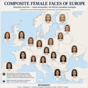
The map above attempts something close to that—but the answer is more complicated than the portraits might suggest.
It shows composite female faces associated with selected European countries, including Sweden, Finland, Ireland, the United Kingdom, France, Germany, Poland, Italy, Greece, Turkey and others.
Each portrait was created by digitally combining multiple photographs into a single face.
The result can be fascinating to look at.
But it is important to understand what these images actually represent—and what they do not represent.
They are not photographs of real people.
They are not official national averages.
And they certainly cannot tell us what every woman from Sweden, Spain, Romania or any other country looks like.
Instead, composite faces are best understood as visual averages of the particular photographs used to create them.
That distinction changes how this map should be interpreted.
What Is a Composite Face?
A composite face is created by combining multiple facial photographs using specialized software.
Researchers first align important points on each photograph, such as:
- Eyes
- Nose
- Mouth
- Jaw
- Facial outline
The software can then average characteristics such as facial shape, coloration and texture.
University of Glasgow research describes composite methods in which information from several individual faces is averaged to create a new identity that does not correspond exactly to any one person.
Imagine placing ten transparent portraits on top of one another and carefully aligning the eyes, nose and mouth.
Features that occur consistently across the photographs remain visible.
Individual differences begin to disappear.
The result is a smoother-looking face representing the statistical center of that particular group of photographs.
The Person You See Does Not Actually Exist
This is perhaps the most interesting aspect of the map.
The woman shown for Sweden is not Swedish.
In fact, she isn’t a real person at all.
The same is true for the portraits labeled:
- Finland
- Ireland
- France
- Poland
- Spain
- Italy
- Greece
- Turkey
- Ukraine
- Romania
They are synthetic composite images produced from multiple source photographs.
Individual contributors become blended together until the final image develops its own appearance.
Composite techniques are useful precisely because the resulting face generally cannot be identified as one of the individuals used to make it.
Why Do Composite Faces Often Look Unusually Smooth?
Many people looking at maps like this immediately notice something strange:
Almost every composite looks unusually symmetrical and polished.
That is partly a consequence of averaging.
Real human faces contain countless small irregularities.
One person’s skin may have a mark in one location.
Another person’s face may be slightly more asymmetrical.
A third may have different lighting or texture.
When many photographs are averaged together, individual irregularities tend to cancel one another out.
Researchers have found that composite or averaged faces can consequently receive higher attractiveness ratings than many of the individual photographs from which they are derived.
That doesn’t mean the composite represents an especially attractive nation.
It means averaging itself changes how the resulting image looks.
Why Many Countries Look Surprisingly Similar
Another interesting feature of the map is how similar several neighboring composites appear.
Look across:
- Sweden
- Finland
- Latvia
- Lithuania
- Poland
or:
- Germany
- Netherlands
- Czechia
- Switzerland
and the differences may seem relatively subtle.
That is partly because composite averaging suppresses individual variation.
Every country contains tremendous facial diversity.
But once many photographs are merged into a single synthetic face, much of that diversity disappears.
The final portraits tend to move toward a visually smoother and more generalized appearance.
So two composites looking similar does not prove that two national populations are biologically identical.
It may simply reflect the mathematical behavior of the averaging process.
Sweden and Finland
The Swedish and Finnish portraits on the map appear relatively close to one another.
That might tempt viewers to interpret the difference as a precise national distinction.
But that would go too far.
Sweden and Finland both contain millions of people with enormous variation in appearance.
Finland also contains Swedish-speaking communities, while Sweden has long received migration from Finland and many other countries.
Modern populations do not stop at national borders.
The correct interpretation is simply:
These two sets of selected photographs produced somewhat similar-looking composites.
Nothing more precise can reliably be concluded from the images alone.
The Baltic Countries
The map also includes:
- Latvia
- Lithuania
and places them near the Nordic composites.
Again, this can make the geography visually interesting.
But Latvia and Lithuania have distinct histories and populations, and neighboring Estonia is linguistically quite different from them despite geographic proximity.
The map should therefore not be interpreted as a biological map of Europe.
Political borders, languages and genetics are three different things.
Ireland and the United Kingdom
Ireland and the United Kingdom provide another useful example.
The portraits appear somewhat different in the map, yet both islands have experienced centuries of movement between their populations.
Millions of people across Britain and Ireland have ancestors from both sides of the Irish Sea.
Modern migration has added even more diversity.
Reducing that complicated population history to one female face per country inevitably removes nearly all of the variation that actually exists.
France
France’s portrait represents another difficulty with national composite maps.
France contains populations whose family histories connect to:
- Western Europe
- Southern Europe
- North Africa
- Sub-Saharan Africa
- the Caribbean
- the Middle East
- Asia
- many other regions
A small photograph sample can therefore never represent the full visual diversity of contemporary France.
The same problem applies to Britain, Germany, Netherlands, Spain and virtually every other country shown.
Germany and the Netherlands
Germany and the Netherlands sit next to each other geographically and share historical connections within the wider Germanic-speaking region of Europe.
Their composites on the map also appear relatively similar.
But that should not be interpreted as evidence that a person’s nationality could be identified from facial structure.
Nationality is a legal and cultural identity—not a facial characteristic.
A person cannot reliably be identified as German or Dutch simply from appearance.
The map is interesting because of the composites, not because it provides a facial nationality detector.
Poland and Czechia
Poland and Czechia also provide neighboring Central European examples.
Both countries experienced repeated migrations and political border changes over centuries.
Polish, German, Czech, Jewish, Ukrainian and other populations interacted throughout the region.
Modern borders often give the impression of populations remaining permanently separated.
History was rarely that neat.
Composite images therefore cannot capture the complicated population movements that shaped modern Central Europe.
Switzerland May Be One of the Hardest Countries to Reduce to One Face
Switzerland is particularly interesting because it has several major linguistic regions:
- German
- French
- Italian
- Romansh
The country sits at an intersection of Central and Western Europe.
A single “Swiss face” therefore hides substantial regional diversity.
Someone from Geneva may have a completely different family background from someone in Ticino or Zürich.
Yet on a composite map, the entire country receives one portrait.
This demonstrates one of the fundamental limitations of the format.
Italy
Italy is another country where regional diversity matters enormously.
For much of history, Italy wasn’t a single unified political country.
The peninsula contained separate kingdoms, republics and states.
Northern Italy interacted strongly with Central Europe.
Southern Italy and Sicily experienced Greek, Roman, Arab, Norman, Spanish and many other influences.
Migration also occurred constantly within and outside the peninsula.
So there is no single facial appearance that can accurately represent “an Italian woman.”
The portrait is simply a composite produced from the selected sample.
Spain
Spain presents a similar situation.
The country includes distinctive historical regions such as:
- Catalonia
- Basque Country
- Galicia
- Andalusia
- Castile
Each has its own history.
Spain also experienced centuries of connections with North Africa and the wider Mediterranean.
Modern immigration has further diversified the population.
A national composite therefore compresses a very complicated population into one synthetic portrait.
Greece
The Greek composite sits at the southeastern edge of the European cluster.
Greece has thousands of years of interaction with populations around:
- The Balkans
- Anatolia
- the Aegean
- the eastern Mediterranean
- southern Italy
Modern Greece also contains significant regional differences between mainland communities and island populations.
Once again, one composite can only describe the source photographs—not all Greek women.
Romania and Hungary
Romania and Hungary sit next to each other geographically but belong to very different language families.
Romanian is a Romance language descended from Latin.
Hungarian belongs to the Uralic language family.
Yet linguistic differences do not translate neatly into facial boundaries.
People migrated across Central and Eastern Europe continuously throughout history.
Empires such as Austria-Hungary also contained large multilingual populations.
This is why maps of language, nationality and physical appearance should never be assumed to show the same thing.
Ukraine
Ukraine is geographically enormous by European standards.
That fact alone should raise questions about representing it with one composite face.
Western Ukraine, central Ukraine, southern Ukraine and eastern Ukraine have experienced different historical influences and migration patterns.
Millions of individual faces obviously cannot be condensed faithfully into a single portrait.
The composite merely illustrates one sample.
Turkey
Turkey provides perhaps the clearest reminder that Europe and Asia do not contain hard population boundaries.
Modern Turkey spans Anatolia and a small portion of southeastern Europe.
Its population history includes layers connected to:
- Ancient Anatolian peoples
- Greeks
- Romans and Byzantines
- Armenians
- Turkic migrations
- Caucasian peoples
- Balkan populations
- Kurdish populations
- many others
Migration from former Ottoman territories also brought large numbers of people into modern Turkey.
The map’s Turkish portrait therefore cannot be interpreted as an ethnic or genetic definition of Turkish identity.
Turkey, like every other country shown, contains enormous variation.
Why National Borders Are a Weak Way to Classify Faces
Political borders can change within a few decades.
Human populations do not suddenly change when a border moves.
Consider Central and Eastern Europe.
During the past several centuries, borders involving:
- Poland
- Germany
- Ukraine
- Romania
- Hungary
- Czechia
- Slovakia
have shifted repeatedly.
A family might live in the same village for generations while the country around them changed several times.
That makes modern national boundaries a poor substitute for detailed population history.
How Sample Selection Can Change the Final Face
This may be the biggest limitation of all.
Imagine creating an “average French woman” from photographs of ten women in Paris.
Then create another using ten women from Marseille.
Then another using photographs from Brittany.
The resulting composites would probably differ.
Age would matter too.
So would:
- Lighting
- Camera quality
- Hairstyle
- Makeup
- Facial expression
- Geographic region
- Sample size
- Selection criteria
If a project does not publish detailed information about the underlying photographs, it is impossible to know how representative the final image actually is.
The widely circulated “average women of the world” composites associated with FaceResearch have exactly this limitation.
PetaPixel reported that the source photographs and the number of images contributing to each country composite were not disclosed.
That is why these images should be treated as interesting visual experiments rather than demographic measurements.
Why Researchers Use Composite Faces Anyway
Despite those limitations, composite faces are useful scientific tools.
Researchers use them to investigate subjects including:
- Face recognition
- Perception
- Typicality
- Attractiveness
- Aging
- Facial cues
- Visual categorization
Averaging can help researchers remove distracting individual variation.
For example, a composite can be created from multiple photographs and then modified experimentally while other characteristics remain relatively controlled.
Research associated with the University of Glasgow has used composite techniques for precisely these kinds of controlled facial-perception experiments.
Researchers also describe composite faces as useful visualizations of differences between image groups, while warning against drawing strong conclusions from small numbers of composites.
Averaging Is Also Used in Facial Recognition Research
Interestingly, averaging faces has uses far beyond maps like this.
University of Glasgow researchers demonstrated that combining several photographs of the same person into an average image could improve automated facial recognition.
Why?
Because individual photographs contain noise.
Lighting changes.
Expressions change.
Camera angles change.
Averaging several images can reduce these temporary variations and preserve more stable facial information.
The principle is related to what happens in national composites, although the scientific goal is different.
What These Faces Cannot Tell You
A composite face cannot reliably tell you:
What an individual citizen of that country will look like.
It cannot determine someone’s nationality.
It cannot establish someone’s ethnicity.
It cannot reveal someone’s genetic ancestry.
It cannot measure how attractive a country’s population is.
And it cannot prove that people from one country have a specific facial feature.
Those conclusions would go far beyond what the images actually contain.
Why “Average Face” Is a Misleading Phrase
The phrase “average French woman” or “average Swedish woman” sounds scientific.
But it can easily create the wrong impression.
A better description would be:
“A composite produced by averaging a selected sample of facial photographs associated with that country.”
It is less catchy.
But it is much more accurate.
The word “average” here describes a mathematical image-processing technique, not an average person in the demographic sense.
Why the Images Still Make a Fascinating Map
None of these limitations makes the map worthless.
Quite the opposite.
It raises interesting questions about how humans perceive faces.
Why do averaged faces often seem smoother?
Why do neighboring composites sometimes appear similar?
How much does the source sample influence what we think a country’s “typical” face looks like?
And perhaps most importantly:
Why are we so tempted to interpret a synthetic portrait as representing millions of real people?
That final question may tell us as much about human perception as the portraits themselves.
Europe Cannot Be Reduced to 17 Faces
The people of Europe have migrated, mixed and moved across borders for thousands of years.
Romans traveled across an empire.
Germanic peoples migrated across Central and Western Europe.
Slavic populations spread across much of Eastern Europe.
Vikings traveled from Scandinavia deep into Europe.
Mediterranean trade connected southern Europe with North Africa and the Middle East.
Empires united populations that today live in different countries.
Modern immigration added countless additional layers.
The result is extraordinary diversity—even within individual towns and families.
A portrait labeled “France,” “Germany” or “Turkey” cannot capture all of that.
The Most Important Thing to Remember
The portraits are visually compelling because our brains are extremely sensitive to faces.
We instinctively search for differences.
We compare eyes, mouths, facial outlines and coloration.
Then we try to connect those differences to the country labels beneath them.
But the safest interpretation is much simpler:
These are artificial composites generated from particular sets of photographs.
They show what happens when those photographs are mathematically averaged.
They do not define what women from those countries look like.
And because the widely circulated datasets do not provide enough information about every underlying sample, the portraits should be treated as visual curiosities and research demonstrations—not official portraits of national populations.
That caveat actually makes the map more interesting.
Instead of asking:
“Is this what women from each country look like?”
a better question is:
“What happens when computers try to turn the diversity of millions of human faces into just one?”
Source Note
Composite-face techniques mathematically average information from multiple facial photographs and are widely used in face-perception research. University of Glasgow research describes methods that average facial shape, coloration and texture to create new composite identities. The popular country-based composites circulated online have also been associated with FaceResearch, but reporting on the project notes that the number and provenance of the source photographs for individual national composites were not disclosed. They should therefore not be treated as official demographic, ethnic or genetic averages.