
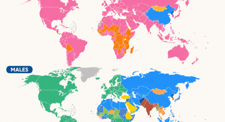
Cancer does not follow the same pattern everywhere.
In one country, breast cancer may account for the largest number of new cancer diagnoses among women. In another, cervical cancer leads. Among men, prostate cancer dominates much of the Americas and Europe, while lung, liver, stomach, colorectal and oral cancers become more prominent in other regions.
The map above uses GLOBOCAN 2022 estimates from the International Agency for Research on Cancer (IARC) to show the cancer site with the largest estimated number of new diagnoses in each country, separately for females and males.
Globally, nearly 20 million new cancer cases and about 9.7 million cancer deaths were estimated in 2022. About one in five people will develop cancer during their lifetime. (IARC)
But those global totals hide enormous geographical differences.
First: What Exactly Does This Map Show?
This distinction is important.
The map shows the most frequently diagnosed cancer by number of new cases in 2022 for each sex and country.
It does not show:
- the cancer with the highest death rate;
- everyone’s personal cancer risk;
- the age-standardized incidence rate;
- or the cancer responsible for the most deaths.
Those can produce very different maps.
For example, a cancer can be diagnosed frequently but have relatively good survival, while another cancer may cause fewer new cases but many more deaths.
IARC’s GLOBOCAN 2022 database covers 185 countries or territories and dozens of cancer types. Because cancer-registration quality varies around the world, figures for some countries are modeled estimates rather than complete counts of every diagnosis. (IARC)
What Are the Most Common Cancers Globally?
Across both sexes combined, the five cancers with the greatest estimated numbers of new cases in 2022 were:
- Lung cancer — 2.48 million
- Breast cancer — 2.30 million
- Colorectal cancer — 1.93 million
- Prostate cancer — 1.47 million
- Stomach cancer — about 969,000
Together, these cancers account for a large share of the world’s cancer burden. (Global Cancer Observatory)
But separating males and females produces a much more interesting geography.
Females: Breast Cancer Dominates Much of the World
The upper map is overwhelmingly pink.
That represents breast cancer.
Globally, breast cancer was by far the most frequently diagnosed cancer among females in 2022, with approximately:
2.30 million new cases
That represented about 23.8% of all cancers diagnosed in females. (Global Cancer Observatory)
Breast cancer is the leading female cancer in much of:
North America,
South America,
Europe,
Australia and New Zealand,
the Middle East,
and large parts of Asia.
Its dominance on the map does not necessarily mean that women in every pink country have exceptionally high breast-cancer incidence.
It means that breast cancer exceeds every other individual cancer type in the number of new diagnoses.
Why Is Breast Cancer So Common?
Breast-cancer risk is influenced by many factors, including:
age,
genetics and family history,
reproductive history,
hormonal exposures,
alcohol consumption,
body weight after menopause,
and physical activity.
But detection also matters enormously.
Countries with widespread mammography and stronger cancer registries will identify more cases that might otherwise go undiagnosed.
This is one reason cancer maps partly reflect healthcare systems as well as biology.
Cervical Cancer Stands Out Across Parts of Africa
The orange regions on the female map represent cancer of the cervix uteri.
Globally, cervical cancer was the fourth-most commonly diagnosed female cancer in 2022, with approximately:
662,000 new cases. (Global Cancer Observatory)
Yet in a number of countries—especially in sub-Saharan Africa—it rises all the way to first place among female cancers.
This is one of the clearest examples of global inequality in cancer prevention.
HPV Is the Key Factor
Nearly all cervical cancers are associated with persistent infection by certain high-risk types of human papillomavirus, or HPV.
That makes cervical cancer unusually preventable compared with many other cancers.
Two interventions are especially powerful:
HPV vaccination
and
cervical screening.
Countries with widespread vaccination, screening and effective treatment of precancerous lesions can dramatically reduce cervical-cancer incidence.
Where those services are less accessible, cervical cancer can remain one of the leading cancers affecting women.
So the orange belt on the map is partly a map of unequal access to prevention.
China Looks Different for Women
China stands out in blue on the female map, representing lung cancer.
Globally, lung cancer was the second-most commonly diagnosed cancer among females, with roughly:
909,000 new cases in 2022. (Global Cancer Observatory)
Its importance varies substantially between countries.
Tobacco smoking is the best-known risk factor, but lung-cancer patterns can also reflect:
secondhand smoke,
household air pollution,
occupational exposures,
outdoor air pollution,
and historical smoking patterns.
Because cancers can take decades to develop, today’s cancer map often reflects exposures that occurred many years earlier.
Thyroid Cancer Appears in a Few Female Populations
The map also includes thyroid cancer as the leading diagnosed cancer in some places.
Globally, thyroid cancer was the fifth-most commonly diagnosed female cancer, with approximately 615,000 cases in 2022. (Global Cancer Observatory)
Thyroid-cancer incidence is particularly sensitive to diagnostic practices.
More ultrasound examinations and imaging can detect very small thyroid tumors that might never have caused symptoms.
That means unusually high thyroid-cancer incidence does not always indicate a dramatic increase in dangerous disease.
It can partly reflect more intensive detection.
This is another reminder that cancer incidence maps are also maps of healthcare practice.
Males: A Much More Divided World
The male map is noticeably more colorful.
No single cancer dominates male diagnoses across the world as strongly as breast cancer does among females.
Globally, the three most frequently diagnosed male cancers in 2022 were:
Lung cancer — 1.57 million cases
Prostate cancer — 1.47 million
Colorectal cancer — 1.07 million. (Global Cancer Observatory)
Together they form the central story of male cancer geography.
Prostate Cancer Dominates the Americas and Much of Europe
Large green areas on the male map represent prostate cancer.
It is the leading cancer diagnosis among men across much of:
North America,
South America,
Western and Northern Europe,
Australia,
and parts of Africa.
Globally, approximately 1.47 million prostate cancers were diagnosed in 2022. (Global Cancer Observatory)
Screening Changes the Numbers
Prostate cancer is another excellent example of how healthcare systems shape incidence statistics.
PSA blood testing can detect prostate cancers long before symptoms appear.
Where testing is common, many more cancers are diagnosed.
Some of those tumors would never have become life-threatening.
This means countries with extensive prostate-cancer testing may appear to have very high incidence partly because they are finding more disease.
A country with fewer diagnoses does not automatically have a healthier male population.
It may simply detect fewer cases.
Lung Cancer Dominates a Huge Part of Eurasia
Blue covers much of the male map across Eastern Europe and Asia.
This represents lung cancer, which was the world’s most commonly diagnosed male cancer in 2022.
It accounted for:
1.57 million male cases
or about 15.2% of all cancers diagnosed in males. (Global Cancer Observatory)
Lung cancer also remains extraordinarily important because it is not merely common—it is the world’s leading cause of cancer death overall. (Global Cancer Observatory)
Tobacco’s Long Shadow
The strongest explanation for the global lung-cancer pattern is historical tobacco exposure.
Cancer incidence today often reflects smoking behavior 20, 30 or even 40 years ago.
This creates a delay between falling smoking rates and falling cancer rates.
Countries where male smoking became widespread earlier can therefore continue experiencing heavy lung-cancer burdens long after smoking prevalence begins declining.
Colorectal Cancer Appears as a Leader in Some Countries
Yellow regions on the male map represent colorectal cancer.
Worldwide, colorectal cancer ranked third among males and third among females in 2022. (Global Cancer Observatory)
Its incidence tends to be relatively high in many higher-income populations.
Risk is associated with a combination of:
age,
genetic susceptibility,
obesity,
physical inactivity,
smoking,
alcohol,
and dietary patterns.
But screening again changes what gets diagnosed.
Colonoscopy and stool-based screening can find:
early cancers
and
precancerous polyps.
That means well-organized screening programs can initially increase detected incidence while ultimately preventing many cancers by removing precancerous lesions.
Stomach Cancer Remains Important in Parts of Asia
Another blue-toned category on the map represents stomach cancer.
Worldwide, stomach cancer accounted for approximately:
969,000 new cases in 2022, across both sexes. (Global Cancer Observatory)
Its distribution is strongly geographical.
Important risk factors include chronic infection with Helicobacter pylori, smoking and some dietary factors.
Historically, stomach cancer was much more common worldwide.
Its decline in many wealthy countries has been linked partly to:
improved food preservation,
refrigeration,
changes in diet,
and declining H. pylori prevalence.
Yet it remains a major public-health problem in several countries.
Liver Cancer Reveals Another Geography
Liver cancer appears as the leading male cancer in some countries, particularly in parts of Africa and Asia.
Globally, there were roughly:
601,000 new liver-cancer cases among men in 2022. (Global Cancer Observatory)
Major risk factors include:
chronic hepatitis B,
chronic hepatitis C,
heavy alcohol exposure,
certain metabolic liver diseases,
and aflatoxin exposure in some regions.
This makes liver cancer another powerful example of how infectious disease can shape cancer geography.
Vaccination against hepatitis B can help prevent liver cancer decades later.
Lip and Oral Cavity Cancer Appears in Parts of South Asia
The map also identifies lip and oral cavity cancer as the leading male cancer in certain countries.
Its strong presence in parts of South Asia is associated with exposures that differ from those common in Europe or North America.
These can include:
smoking,
smokeless tobacco,
betel quid or areca nut use,
and alcohol.
The result is a cancer pattern strongly connected to regional habits.
This demonstrates why simply speaking of a universal “cancer lifestyle” makes little sense.
Different exposures dominate in different societies.
Kaposi Sarcoma Tells a Very Different Story
Pink areas representing Kaposi sarcoma appear in parts of Africa.
Kaposi sarcoma is associated with infection by human herpesvirus 8, and its incidence rose dramatically during the HIV/AIDS epidemic because weakened immune systems allowed the disease to develop more readily.
Wider access to effective HIV treatment has reduced Kaposi sarcoma substantially in many places.
Its presence on cancer maps therefore tells a story not just about cancer, but about:
infectious disease,
immune health,
HIV treatment,
and access to healthcare.
Why Rich and Poor Countries Can Have Different Cancer Profiles
Cancer patterns change as countries develop.
In lower-income settings, a greater share of cancer may be connected with chronic infections, including:
HPV,
hepatitis viruses,
H. pylori,
and HIV-related conditions.
As countries become wealthier and populations live longer, cancers associated with ageing and changing lifestyles often become more prominent.
These include:
breast,
colorectal,
prostate,
and lung cancer.
But the distinction is not absolute.
Every country contains a mixture.
And as global populations age, cancer numbers are expected to rise sharply.
IARC estimates that annual new cancer cases could exceed 35 million by 2050, roughly 77% more than in 2022, largely because populations are growing and ageing. (IARC)
Incidence Is Not the Same as Mortality
This is perhaps the most important warning when interpreting the infographic.
The most commonly diagnosed cancer is not necessarily the cancer most likely to kill people.
Globally in 2022:
Lung cancer ranked first in deaths.
Colorectal cancer ranked second.
Liver cancer ranked third.
Breast cancer, despite being the second-most diagnosed cancer overall, ranked fourth in cancer deaths. (Global Cancer Observatory)
Why?
Because survival varies enormously by cancer type.
It also varies according to:
how early the cancer is detected,
whether treatment is available,
the patient’s overall health,
and the quality of the healthcare system.
A map of cancer mortality would therefore look noticeably different from this incidence map.
Why Cancer Registries Matter
There is another hidden layer underneath the map:
data quality.
Countries with long-established population cancer registries can measure incidence directly with considerable accuracy.
Other countries have incomplete registries or limited data.
GLOBOCAN therefore combines multiple sources and statistical methods to generate estimates for places where direct information is incomplete.
IARC describes its figures as estimates based on the best data sources available in each country. (IARC)
So a sharp national border on the infographic should not create the illusion of absolute precision.
Cancer burden does not suddenly change at a border crossing.
And some national estimates carry greater uncertainty than others.
What the Map Really Reveals
At first glance, this is a map of cancer.
Look deeper and it becomes a map of:
tobacco history,
vaccination,
infection,
diet,
ageing,
screening,
healthcare access,
economic development,
and diagnostic practices.
Breast cancer dominates female diagnoses across much of the world.
Cervical cancer remains disproportionately important where HPV vaccination and screening are less accessible.
Prostate cancer dominates male diagnoses in many countries with extensive detection and ageing populations.
Lung cancer traces decades of tobacco exposure.
Liver and stomach cancers reflect important infectious and environmental risks.
Oral cancer reveals regional tobacco and areca-nut traditions.
Every color therefore tells a different public-health story.
A Major Reason for Hope: Many Cancers Can Be Prevented
The map may look intimidating, but cancer is not inevitable.
IARC notes that a substantial proportion of cancer cases could potentially be prevented through known measures. (IARC)
Important prevention strategies include:
avoiding tobacco,
vaccination against HPV and hepatitis B,
limiting alcohol,
maintaining a healthy body weight,
physical activity,
protecting against certain occupational exposures,
and participating in recommended screening programs.
For several cancers, early diagnosis also dramatically improves the chances of successful treatment.
Accuracy Note for the Infographic
The infographic’s sourcing is appropriate:
IARC Global Cancer Observatory — GLOBOCAN 2022, version 1.1, released in 2024.
I would keep the map, but add one sentence beneath the subtitle:
“Colors show the cancer site with the largest estimated number of new cases in 2022 for each sex—not the cancer causing the most deaths or the highest age-standardized incidence rate.”
That clarification prevents the biggest likely misunderstanding.
I would also consider replacing “latest available GLOBOCAN 2022 estimates” with:
“GLOBOCAN 2022 incidence estimates, version 1.1 (released 2024)”
because it makes the underlying year unambiguous. IARC’s current Cancer Today platform still identifies the dataset as GLOBOCAN 2022 version 1.1. (Global Cancer Observatory)