
Blood is something every human has.
But it is surprisingly different from one population to another.
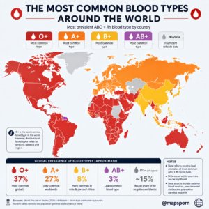
In Canada and Australia, O-positive is the most common blood type.
In Japan, A-positive is especially common.
Across parts of South and Central Asia, blood group B occurs much more frequently than it does in Western Europe or the Americas.
And among many Indigenous populations of Central and South America, blood group O has historically reached extraordinarily high frequencies.
These differences create one of the most fascinating maps in human genetics.
The basic blood groups are the same everywhere.
What changes is how common each one is.
First: What Does O+, A+, B+ or AB+ Actually Mean?
The familiar eight blood types are produced by combining two major blood-group systems:
ABO
and
RhD.
The ABO system divides people into four principal groups:
A, B, AB and O.
Your group depends on which A or B antigens are present on the surface of your red blood cells.
Type A has A antigen.
Type B has B antigen.
Type AB has both.
Type O has neither A nor B antigen.
These differences are inherited genetically. The A and B versions of the ABO gene are codominant, while the common O allele is recessive. (NCBI)
Then comes the plus or minus.
If your red blood cells carry the RhD antigen, you are called Rh-positive.
If they do not, you are Rh-negative. (NCBI)
So:
O+ = O blood group + RhD antigen
A− = A blood group without RhD
and so on.
That gives us the familiar eight common combinations.
O Is the World’s Most Widespread ABO Group
The safest broad statement from worldwide research is:
Blood group O is the most common ABO phenotype globally.
Scientific reviews consistently show enormous geographical variation, but O tends to dominate overall. One review found that O frequencies can range from less than one-third of populations in some regions to around 80% in parts of Central and South America. (PubMed Central (PMC))
A separate review summarized the worldwide ordering broadly as:
O → A → B → AB. (PubMed Central (PMC))
But those are ABO groups.
Once Rh status is added, O-positive becomes especially common because most of humanity is Rh-positive.
Why O+ Dominates Much of the Americas
The map’s strong O+ pattern across North, Central and South America broadly makes sense.
Canadian Blood Services currently reports:
O+ — 37%
A+ — 31%
with O-positive being Canada’s most common blood type. (Canadian Blood Services)
Australia shows a remarkably similar pattern despite being on the other side of the world.
Australian Red Cross Lifeblood’s latest research puts:
O+ — about 38%
A+ — about 32%
B+ — about 11–12%
AB+ — about 3%. (Australian Red Cross Lifeblood)
In many Central and South American populations, O is even more dominant.
Anthropological and genetic studies have long found exceptionally high O frequencies among Indigenous American populations. A scientific review describes the Americas as having particularly high group O frequencies, especially among Indigenous populations in Central and South America. (PubMed Central (PMC))
Migration and population mixing mean modern national populations are more complicated, but that historical pattern is still visible.
Europe: A Close Competition Between A and O
Europe is particularly interesting because A and O are often both very common.
In some populations, A is slightly ahead.
In others, O wins.
That makes a simple one-color country map risky.
For example, the infographic shows the United Kingdom as A+.
Current NHS data say otherwise.
Approximately:
36% of the UK population is O+
while about:
30% is A+. (NHS Blood and Transplant)
So Britain should be O+ on a current map.
On the other hand, some continental European populations do have A as the leading ABO group.
One published comparison reported:
Sweden: A 44%, O 38%
and
France: A 44%, O 42%. (PubMed Central (PMC))
That explains the broader European tendency shown on the infographic.
But the important point is that the gap between A and O is often small.
Calling an entire country “A+ territory” can hide substantial internal variation.
Japan: A Is Clearly Common
Japan is one of the strongest examples of a population where blood group A is especially prominent.
Japanese Ministry of Health figures cited in peer-reviewed research give approximately:
A — 40%
O — 30%
B — 20%
AB — 10%. (PubMed Central (PMC))
Another large Japanese cohort found very similar results:
A around 38.6%, O around 29.4%, B around 22.4%, and AB around 9.6%. (PubMed Central (PMC))
Because Rh-negative blood is extremely uncommon in East Asian populations, A+ is therefore a reasonable representation for Japan.
This is one of the areas where the map works well.
China Is Much More Complicated
China is where the infographic needs a major correction.
It labels China as B+.
But the largest modern nationwide analysis I found does not support that.
Researchers compiled ABO information for more than 23 million people across 34 provincial-level regions and adjusted it to China’s national population.
They estimated:
O — 34.20%
A — 28.72%
B — 28.17%
AB — 8.91%. (PubMed Central (PMC))
So O is the largest national group.
But the same study found enormous regional variation.
In parts of northern China, B can be the most common blood group.
In southern regions, O becomes much more dominant.
For example, O exceeded 40% in some southern provinces, while B was particularly common across parts of northern China. (PubMed Central (PMC))
That makes China a perfect example of why political borders do not equal genetic borders.
A national average hides hundreds of millions of people and many distinct regional populations.
India Is Also More Diverse Than One Color Suggests
India is colored B+ on the infographic.
There is certainly a reason people associate India with blood group B: B occurs at much higher frequencies there than in many Western European populations.
But nationwide studies do not necessarily make B the most common group.
A multicenter study covering blood banks in several Indian regions found:
O — 37.12%
B — 32.26%
A — 22.88%
AB — 7.74%.
About 94.61% were Rh-positive. (PubMed Central (PMC))
So for that dataset, O+ would actually be the most common combined type.
Other regional Indian studies can produce different rankings.
That is precisely the problem.
India contains more than 1.4 billion people and tremendous genetic and ethnic diversity.
A national map necessarily oversimplifies it.
Africa Has Strong O Frequencies—but Enormous Diversity
Much of Africa appears O+ on the map.
That broad pattern has substantial support.
For example, a recent systematic review from Ghana estimated:
O — 54.72%
B — 21.74%
A — 19.65%
AB — 3.89%.
About 92.3% were Rh-positive. (PubMed Central (PMC))
Other African populations have different distributions, however.
Africa contains more human genetic diversity than any other continent.
So one red O+ color stretching across dozens of countries should not be interpreted as meaning Africans share one uniform blood-group profile.
They do not.
Why Does Blood Type Vary Geographically?
Blood types are inherited.
That means their geographical distribution reflects thousands of years of population history.
Several processes can influence the frequencies.
Migration
When populations move, they carry their blood-group alleles with them.
Migration and population mixing gradually change local frequencies.
Founder effects
A small group establishing a new population may happen to contain unusually high frequencies of one blood group.
Its descendants can retain that pattern for many generations.
Genetic drift
Random changes can become especially important in smaller or historically isolated populations.
Natural selection
Researchers have also investigated whether certain blood types offered advantages or disadvantages against particular infectious diseases.
The National Library of Medicine notes that differences in ABO frequencies between populations suggest that evolutionary pressures, possibly including infectious disease, may have influenced their distribution. (NCBI)
This does not mean one blood type is universally “better.”
An advantage against one disease may be neutral—or even disadvantageous—in another environment.
Rh-Negative Is Not 15% Everywhere
This is another part of the infographic I would change.
The graphic says:
Rh-negative — approximately 15% worldwide.
That is too broad.
Around 15% is a commonly cited figure for populations of European ancestry.
The worldwide pattern is dramatically different.
NCBI summarizes RhD-negative prevalence at approximately:
15% among Caucasian populations
8% among Black populations
and only around:
1% among Asian populations. (NCBI)
Australia’s modern population data put all Rh-negative types combined at roughly 14%, reflecting its population history and demographic composition. (Australian Red Cross Lifeblood)
But in many East and Southeast Asian populations, Rh-negative blood is extremely rare.
A large Indonesian study, for example, found RhD-positive frequencies around 99.5%, while published figures for several neighboring Southeast Asian populations were also around 99% or higher. (PubMed Central (PMC))
So I would replace the infographic’s “~15% worldwide” with:
Rh-negative prevalence varies dramatically: roughly 15% in many European-ancestry populations but often below 1–2% in much of East and Southeast Asia.
That is much more informative.
Why Blood Type Matters for Transfusions
The ABO system is not merely an interesting genetic trait.
It is critically important medically.
People naturally produce antibodies against certain ABO antigens they do not possess.
If incompatible red blood cells are transfused, those antibodies can attack the donor cells and cause a potentially severe hemolytic reaction. (NCBI)
That is why hospitals carefully type and crossmatch blood before transfusion.
For red blood cells:
O-negative is commonly called the universal red-cell donor type because it lacks A, B and RhD antigens.
AB-positive recipients can generally receive red cells from all eight basic ABO/RhD groups.
But real transfusion medicine is more complicated than those classroom rules because hundreds of other red-cell antigens exist. NHS Blood and Transplant notes that more than 300 blood-group antigens are known. (NHS Blood and Transplant)
Doctors therefore match blood much more carefully when circumstances permit.
Rare Does Not Mean More Valuable—or Less Valuable
People often ask which blood type is “best.”
There isn’t one.
Different blood types are valuable for different reasons.
O-negative red cells are extraordinarily useful in emergencies.
O-positive is valuable because enormous numbers of patients need it.
AB plasma has special compatibility advantages.
And patients requiring repeated transfusions may need donors with much rarer antigen combinations beyond ABO and Rh.
So the most valuable blood donation is often simply:
the blood type hospitals need at that moment.
Why Country-Level Blood Maps Need Caution
Blood type is not determined by nationality.
A Canadian does not genetically become O+ by crossing the border.
A Chinese citizen is not automatically B+.
A French person is not automatically A+.
Modern countries contain populations with ancestry from all over the world.
Canada illustrates this clearly: its current national figures are O+ 37% and A+ 31%, but those percentages will continue changing as its demographic composition changes. (Canadian Blood Services)
Australia has already documented exactly that effect.
Australian Red Cross researchers found that national blood-type frequencies have shifted over time and linked part of the change to increasing population diversity. (Australian Red Cross Lifeblood)
So these maps are not permanent genetic maps.
They are population snapshots.
The Most Interesting Global Pattern
Strip away the national borders and a broad picture emerges.
O is especially dominant across much of the Americas and many African populations.
A reaches high frequencies across parts of Europe and Japan.
B becomes much more prominent across South, Central and parts of northern Asia.
AB remains relatively uncommon almost everywhere.
And:
Rh-negative is disproportionately concentrated in populations with European ancestry.
Those patterns are the result of thousands of years of migration, isolation, population growth and evolution.
A blood-type map therefore tells us more than what might be available at a blood bank.
It offers a small glimpse into humanity’s population history.
Final Thought
We all share the same basic ABO and Rh blood-group systems.
Yet the frequencies vary dramatically depending on where populations developed and how people moved across the world.
That is what makes the map fascinating.
The Americas show strong O frequencies.
Parts of Europe lean toward A.
Asia contains much stronger B frequencies than western Europe.
And Rh-negative, which seems relatively ordinary in Europe, becomes extraordinarily rare across much of East Asia.
Blood looks the same to the naked eye.
But hidden on the surface of our red cells is a geographical record of human ancestry stretching back thousands of years.
Accuracy Note for Your Infographic
I would keep the concept but revise several labels before publication. Canada and Australia are correctly shown as O+, with current official blood-service data putting O+ at approximately 37–38%. (Canadian Blood Services) Japan as A+ is also well supported, with blood group A around 40% nationally. (PubMed Central (PMC))
However, I would change the UK to O+, reconsider China and India as B+, and remove the claim that 15% of the entire world is Rh-negative. China’s largest nationwide analysis found O to be the most common ABO group, while a multicenter Indian study likewise found O slightly ahead of B. (PubMed Central (PMC))
I would also replace the footer’s exact global figures—O+ 37%, A+ 27%, B+ 8%, AB+ 3%—with broader wording unless you have a single population-weighted global dataset supporting those percentages. Scientific literature strongly supports O as the world’s most prevalent ABO group, but exact global ABO+Rh percentages vary with dataset and methodology. (PubMed Central (PMC))