
Imagine that exactly 1,000 babies were born around the world and their birthplaces matched the expected distribution of global live births in 2025.
Where would they arrive?
According to the proportions shown in this map, the answer would look dramatically different from a map based simply on population size.
About 459 of the 1,000 births would occur in Asia.
Around 350 would occur in Africa.
The Americas would account for roughly 147.
Europe would account for only about 42 under the infographic’s geographic classification.
And only a tiny share would occur in Oceania, although that particular figure should be rechecked.
Even more striking is the country-level picture.
India alone would account for roughly 174 of every 1,000 babies born worldwide.
Nigeria would account for 58.
China for 66.
Pakistan for 52.
The Democratic Republic of the Congo for 34.
Indonesia for 33.
These numbers reveal something larger than where maternity wards are busiest today.
They show how the demographic center of the world is gradually shifting.
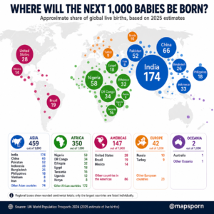
What Does “The Next 1,000 Babies” Actually Mean?
The title is a statistical thought experiment.
It does not mean researchers know the exact countries where the next literal sequence of 1,000 babies will be delivered.
Births occur continuously around the planet, and the exact short-term order would obviously vary.
Instead, the map takes the projected annual distribution of live births and scales it down to an easy-to-understand group of 1,000.
So if a country represents 17.4% of projected global births, it receives approximately:
174 babies out of 1,000.
That makes enormous demographic numbers easier to visualize.
The underlying source, UN DESA’s World Population Prospects 2024, is the United Nations’ official global population estimate and projection series, covering 237 countries and areas and extending projections through 2100. (United Nations)
India: About 174 of Every 1,000 Babies
The largest circle on the map belongs to India.
According to the infographic’s allocation, approximately:
174 of the next 1,000 babies
would be born there.
That is 17.4% of all global births.
Or, put another way:
roughly one out of every six babies worldwide.
The remarkable thing is that India’s fertility rate has fallen substantially over recent decades.
So why does India still produce more births than any other country?
The answer is scale.
India has more than 1.4 billion people and an enormous population of women in their reproductive years.
Even when the average number of children per woman declines, a very large generation of potential parents can still produce an enormous number of births.
Demographers call part of this effect population momentum.
A country can continue adding large numbers of people long after fertility begins falling because its age structure contains so many young adults.
This is why fertility rate and total number of babies are not the same statistic.
A smaller country could have a much higher fertility rate than India while producing only a fraction as many babies.
China: 66 Babies Despite a Similar Population Size
China provides perhaps the clearest contrast.
The infographic assigns China approximately:
66 births per 1,000 worldwide.
India gets 174.
Yet the populations of India and China are of broadly similar magnitude.
Why the enormous difference?
China has experienced decades of rapidly falling fertility and population ageing.
Its population has already passed its peak under the UN’s latest demographic estimates, while India continues to have a younger age structure. The UN says China was among the countries whose populations had already peaked by the time of the 2024 revision. (United Nations)
That means there are proportionally fewer women in the ages where most births occur, and those women are having fewer children on average.
So two countries with roughly comparable populations can produce very different numbers of babies.
That is one of the most important lessons on the entire map.
Nigeria: More Births Than All of Europe?
Nigeria receives:
58 of every 1,000 global births
on the infographic.
Under the map’s regional allocation, all of Europe combined gets only 42.
That means Nigeria alone would produce more babies than the entire European region shown here.
Nigeria’s population is much smaller than Europe’s.
The difference comes from age structure and fertility.
Nigeria has an exceptionally young population, with large numbers of people entering childbearing ages.
Europe, by contrast, contains many older populations where births are relatively few.
The UN expects sub-Saharan Africa to experience by far the strongest population growth of any major world region during the coming decades. Its population is projected to rise substantially through the middle of the century, with several countries—including Nigeria and the Democratic Republic of the Congo—becoming much larger in global population rankings. (United Nations)
Pakistan: About 52 of Every 1,000
Pakistan is another demographic heavyweight.
The infographic allocates it:
52 babies out of 1,000.
That is more than five percent of all births worldwide.
And according to this map, Pakistan by itself would have more births than the entire European total of 42.
Pakistan combines a very large population with a relatively young age structure and fertility that remains higher than in most of East Asia or Europe.
That combination produces millions of births every year.
The UN expects Pakistan to continue expanding strongly and projects that it will become one of the world’s largest populations during the coming decades. (United Nations)
Four Countries Account for More Than One-Third
Here is one of the most striking facts hidden in the graphic.
Add together:
India — 174
China — 66
Nigeria — 58
Pakistan — 52
and you get:
350 out of 1,000 births.
In other words, just four countries would account for approximately:
35% of all babies born worldwide.
Even more remarkably, that is exactly the same share the infographic assigns to the entire African continent.
A handful of very large countries therefore exert enormous influence on global demographic trends.
Africa: 350 of the Next 1,000 Babies
Africa is perhaps the most important part of this map when thinking about the future.
According to the infographic, about:
350 of every 1,000 births
would occur somewhere in Africa.
Nigeria leads with 58.
The Democratic Republic of the Congo contributes 34.
Ethiopia contributes 32.
Egypt contributes 18.
Tanzania contributes 16.
Uganda contributes 12.
Kenya contributes 8.
And dozens of other African countries make up the remaining total.
This pattern reflects two characteristics that distinguish much of Africa from Europe and East Asia:
higher fertility and much younger populations.
The UN reports that more than one in ten countries and areas worldwide still have fertility of four births per woman or higher, with most located in sub-Saharan Africa. (United Nations)
That doesn’t mean fertility will remain at current levels forever.
The UN expects fertility to continue declining in many high-fertility countries.
But because their populations are so young, the absolute number of births can remain very large even while family sizes decline.
Democratic Republic of the Congo: A Future Demographic Giant
The Democratic Republic of the Congo receives:
34 births per 1,000 globally
on the map.
That may surprise people because the DRC is nowhere near the top of today’s list of largest economies or most internationally prominent countries.
Demographically, however, it is becoming enormously important.
The UN projects the DRC’s population to rise from roughly 108 million in 2024 to around 235 million by 2054 and more than 400 million by the end of the century under its medium projection. (studylib.net)
That means today’s high birth numbers will reshape tomorrow’s population rankings.
Ethiopia: 32 of Every 1,000
Ethiopia receives approximately:
32 of the 1,000 births.
Its enormous young population means it remains one of the world’s largest sources of new births.
Like many rapidly growing countries, Ethiopia faces both an opportunity and a challenge.
A large young generation can eventually create a powerful workforce.
But before that happens, governments need enough:
schools, healthcare, housing, infrastructure and jobs
for rapidly growing generations.
Population growth itself is neither automatically good nor bad.
What matters enormously is whether economic and social development keeps pace.
Tanzania and Uganda Are Quietly Becoming Much More Important
Tanzania receives approximately 16 of the 1,000 births and Uganda another 12.
Those numbers may look relatively small beside India’s 174.
But they signal an important long-term trend.
The UN expects Tanzania to become one of the world’s ten largest countries by population before the end of the century under its medium projection. (United Nations)
This demonstrates why maps of births can sometimes tell us more about the future than maps of today’s population.
Today’s largest population centers reflect decades of past demographic change.
Today’s babies indicate where tomorrow’s adults will increasingly live.
Asia Still Leads the World
Africa’s demographic rise gets enormous attention, but Asia still accounts for the largest share of births in the infographic:
459 out of 1,000.
That is nearly 46%.
India is the biggest reason.
But Asia also contains:
China at 66,
Pakistan at 52,
Indonesia at 33,
Bangladesh at 26,
the Philippines at 18,
Iran and Vietnam at around 8 each,
plus births across dozens of other countries.
Asia therefore remains the world’s demographic center in absolute terms.
But its internal geography is changing.
South Asia remains relatively birth-heavy.
Parts of East Asia have moved into extremely low fertility.
Southeast Asia occupies a position somewhere between those two extremes.
Indonesia: 33 of Every 1,000 Babies
Indonesia is the world’s fourth-largest country by population, and its scale is reflected in the birth map.
It accounts for around:
33 babies out of every 1,000 worldwide.
Indonesia’s fertility has declined greatly from historical levels.
But as with India, an enormous existing population means that even moderate fertility produces millions of births.
The UN still expects Indonesia’s population to continue growing for decades, although much more slowly than in the past. (United Nations)
Bangladesh: 26
Bangladesh gets:
26 births per 1,000 globally.
This illustrates another demographic principle.
A country does not need a huge land area to produce an enormous number of babies.
Bangladesh is geographically small but exceptionally densely populated, with more than 170 million residents.
Even after major declines in fertility, its population base keeps annual births high.
The Philippines: 18
The Philippines receives another:
18 out of 1,000 births.
Its population remains relatively young compared with countries such as China, Japan and South Korea.
That creates a very different demographic outlook from much of East Asia.
So even within the same broad region, neighboring countries can be at completely different stages of the demographic transition.
The Americas: About 147 of 1,000
The infographic allocates approximately:
147 births to the Americas.
The United States is the largest contributor at 28.
Brazil follows at 19.
Mexico contributes 14.
The remaining countries across North America, Central America, the Caribbean and South America make up another 86.
The Americas occupy an interesting demographic middle ground.
Fertility has fallen substantially across much of Latin America.
Several Latin American countries now have fertility below replacement level.
Yet the region still contains hundreds of millions of relatively young adults, meaning it continues to produce far more births than Europe.
United States: 28 of Every 1,000
The United States accounts for roughly:
28 births per 1,000 globally
in the infographic.
That is only 2.8%.
This may seem surprisingly low considering the United States is the world’s third-largest country by population.
But fertility in the U.S. is well below replacement level.
Population growth increasingly depends on migration as well as natural increase, and the UN expects immigration to be the primary long-term driver of growth in countries including the United States, Canada and Australia. (United Nations)
Europe: Only a Small Fraction of Global Births
Under the infographic’s classification:
only 42 of 1,000 babies
would be born in Europe.
That means Europe would account for just over four percent.
By comparison:
India alone gets 174.
Nigeria gets 58.
Pakistan gets 52.
Europe’s small share reflects decades of declining fertility combined with ageing populations.
Many European countries now have far fewer people entering parenthood than they did several generations ago.
The UN’s 2024 revision reports a global fertility rate of around 2.25 live births per woman, but many countries—especially in Europe and East Asia—are already well below the approximate replacement level. (United Nations)
Asia and Africa Together Dominate Global Births
Perhaps the simplest way to understand the whole map is to combine its two largest regions.
Asia:
459
Africa:
350
Together:
809 of the next 1,000 babies.
That is about:
81% of global births.
According to this visualization, more than four out of every five newborns would therefore arrive somewhere in Asia or Africa.
The Americas, Europe and Oceania together would account for fewer than one in five.
That is a profoundly different world from the geographic imagination many people inherit from maps centered on Europe and North America.
A Birth Map Is Not the Same as a Population Map
Another important point:
The share of babies born in a country does not equal that country’s share of world population.
A country with:
a young population and higher fertility
will produce a disproportionately large share of babies.
A country with:
an older population and very low fertility
will produce a disproportionately small share.
That is why Nigeria looks enormous on this map while much of Europe almost disappears.
And it is why India produces far more babies than China even though their total populations are broadly comparable.
Birth maps visualize demographic momentum, not just population size.
It Also Does Not Show Citizenship or Ethnicity
“Born in India” does not necessarily mean every child is an Indian citizen under every legal circumstance.
Likewise, a baby born in the United States may have parents from Mexico, India, Nigeria, China or dozens of other countries.
This map measures location of live birth in the demographic data.
It does not show:
ancestry, ethnicity, religion or necessarily future nationality.
That distinction is worth keeping in a website article because migration increasingly separates birthplace from family origin.
What Will This Map Look Like in 2050?
This may be the most interesting question.
The map is unlikely to remain the same.
China’s share is expected to continue shrinking as its population ages.
Several European and East Asian countries will also produce fewer births.
Meanwhile, the relative importance of sub-Saharan Africa will continue increasing.
The UN projects sub-Saharan Africa’s population to rise by roughly 79% by 2054, reaching around 2.2 billion people. (United Nations)
Countries including Nigeria, the Democratic Republic of the Congo, Tanzania and others are therefore likely to account for increasingly large shares of future global births.
India will remain a demographic giant, but its fertility decline means its own share will eventually decrease too.
So the center of gravity of global births is gradually moving:
away from Europe and East Asia and increasingly toward South Asia and especially sub-Saharan Africa.
Why This Matters
Babies born in 2025 will be around 25 years old in 2050.
They will form the next generation of:
workers, voters, parents, consumers, entrepreneurs and political leaders.
Where they are born therefore influences the future geography of:
economic growth,
education demand,
urbanization,
migration,
labor markets
and international influence.
A country producing millions of babies every year needs enormous investments in schools today.
A country producing fewer babies while its population ages faces the opposite challenge: maintaining its workforce, pension system and healthcare services.
These are not distant demographic abstractions.
They shape policy right now.
The Most Surprising Comparisons on the Map
Some of the strongest insights become clearer when the numbers are compared directly.
India alone accounts for more births than the entire Americas in this visualization.
Nigeria alone exceeds the map’s entire European total.
Pakistan alone also exceeds Europe.
India plus Nigeria accounts for almost one-quarter of all births.
And India, China, Nigeria and Pakistan together account for about 35% of the world’s babies.
Meanwhile, Asia and Africa combined account for roughly 81%.
That is the story the map tells better than almost any population table could.
The world is still growing, but new generations are increasingly concentrated in a relatively small number of large, young countries.
Final Thought
Ask someone to imagine where the world’s next thousand children will be born and they might instinctively distribute them roughly according to the familiar political map.
The reality is nothing like that.
The circles would cluster heavily around:
India.
Nigeria.
Pakistan.
China.
The Democratic Republic of the Congo.
Ethiopia.
Indonesia.
Europe would look surprisingly small.
Much of East Asia would be smaller than its enormous current population suggests.
And Africa would occupy an increasingly important place in the world’s demographic future.
Today’s population map shows where humanity lives now.
A map of births gives us a glimpse of where more of humanity’s next generation is beginning life.
Accuracy Note for the Infographic
The source choice is strong: UN DESA’s World Population Prospects 2024 is the United Nations’ official global population estimate and projection dataset. However, 2025 values are projections, because WPP 2024 treats 1950–2023 as estimates and 2024–2100 as projections. I would therefore change “based on 2025 estimates” to “based on the UN WPP 2024 medium projection for 2025.” (UNdata)
I would also define your continent convention. Under the official UN M49 classification, Türkiye is in Western Asia and Russia is in Eastern Europe, whereas the infographic places Türkiye in Europe. (UNSD)
Finally, I recommend recalculating Oceania = 2/1,000. Australia alone recorded about 300,000 births in 2024–25, so the regional total should be checked carefully once Papua New Guinea, New Zealand and the Pacific islands are included. (AIHW)