
Look at a typical world map and you may notice something strange.
Greenland appears almost as large as Africa.
Europe looks enormous compared with South America.
Russia stretches across a huge portion of the planet.
But there is a problem:
The world does not actually look like that.
Many familiar world maps dramatically distort the size of countries.
The reason is one of the most famous map projections in history:
The Mercator projection.
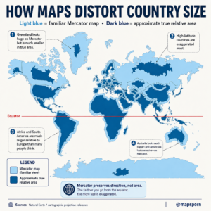
Why Do Maps Distort the World?
Earth is a sphere.
A globe can represent the planet accurately because it keeps the natural shape of the surface.
But when cartographers try to flatten a round Earth onto a rectangular map, something has to change.
A flat map cannot perfectly preserve:
- Size
- Shape
- Distance
- Direction
Every map projection makes compromises.
The Mercator projection chooses to preserve:
✅ Direction
✅ Angles
✅ Navigation accuracy
But the cost is:
❌ Area accuracy
Countries near the poles become stretched and appear much larger than they really are.
What Is the Mercator Projection?
The Mercator projection was created in 1569 by Flemish cartographer:
Gerardus Mercator
It was designed mainly for sailors during the Age of Exploration.
Before modern GPS, navigation across oceans was extremely difficult.
Mercator’s innovation was that a straight line on the map represented a constant compass direction.
This made it extremely useful for:
- Ocean navigation
- Sailing routes
- Maritime exploration
For centuries, it became the standard world map.
Why Greenland Looks Huge
One of the most famous examples is Greenland.
On a Mercator map:
Greenland looks almost the same size as Africa.
But in reality:
Africa
Area:
≈ 30.3 million km²
Greenland
Area:
≈ 2.2 million km²
Africa is about:
14 times larger than Greenland
The reason Greenland appears massive is because it is located near the Arctic.
The Mercator projection stretches areas farther from the equator.
High-Latitude Countries Are Most Distorted
The closer a country is to the North or South Pole, the more exaggerated its size becomes.
Countries heavily affected include:
Russia
Russia is already the largest country in the world.
Area:
≈ 17.1 million km²
But on Mercator maps, its northern regions appear even more enormous.
Canada
Canada is the second-largest country in the world.
Because much of Canada is located in northern latitudes, it appears larger than its actual proportion.
Greenland
Greenland is the classic example of extreme distortion.
Its Arctic location causes massive visual enlargement.
Africa Is Much Bigger Than It Looks
One of the biggest misconceptions created by traditional world maps is the size of Africa.
Africa often looks smaller than it really is because it is located around the equator, where Mercator distortion is minimal.
Africa covers:
≈ 30.3 million km²
It could fit:
- The United States
- China
- India
- Japan
- Several European countries
inside its borders.
The continent is enormous.
South America Is Also Underrated
South America is another continent whose size is often underestimated.
Its land area:
≈ 17.8 million km²
It is larger than:
- Europe
- Australia
- Antarctica (excluding ice variations)
Yet many people imagine South America as much smaller because of traditional map views.
Australia’s Size Is Misunderstood
Australia is often shown smaller than it feels because it sits in a lower latitude region.
Its actual area:
≈ 7.7 million km²
It is:
- Larger than Europe
- Nearly twice the size of India
But on many world maps, Europe appears comparable or even larger.
Antarctica Is the Biggest Visual Illusion
Antarctica is perhaps the most distorted landmass on a Mercator map.
Near the South Pole, the projection stretches the continent dramatically.
On many maps, Antarctica appears to wrap around the bottom of the world.
Its actual area:
≈ 14 million km²
Large, yes — but not the gigantic continent shown on many classroom maps.
Why Do We Still Use Mercator Maps?
Despite its distortion, Mercator remains useful.
It is excellent for:
Navigation
Ships and aircraft can follow straight-line compass routes.
Digital Maps
Many online mapping systems use modified versions of Mercator because it works well with:
- Zooming
- Web interfaces
- Global navigation
Historical Importance
For centuries, it was the standard tool for explorers and sailors.
Better Maps for Comparing Country Size
If the goal is comparing land area, other projections are better.
Examples include:
Equal-area projections
These preserve the true size of countries.
They may distort shape slightly, but they provide a more accurate comparison of land area.
Popular examples:
- Mollweide projection
- Gall-Peters projection
- Equal Earth projection
These maps show Africa, South America and other equatorial regions more realistically.
The Biggest Lesson From This Map
A map is not always a perfect picture of reality.
Every map tells a story based on what it chooses to preserve.
The Mercator projection was created to help sailors navigate oceans — not to compare the true size of countries.
So the next time you see Greenland looking enormous or Africa looking surprisingly small, remember:
The map is distorted, not the planet.
Understanding map projections helps us see the world more accurately.
Sources:
Natural Earth geographic data; cartographic projection references; International Cartographic Association materials.